Two days before WWDC 2011, Jan-Michael is continuing his prediction series regarding iOS 5 which will be announced for the first time on WWDC 2011 by June 6. He demonstrates the dynamic icon concept. Let's check out the video after the jump.

Users have the option of turning on these "dynamic icons" by going to the Settings. Icons are granted the ability to change their appearance given a variety of push notifications. In turn, once the notification badge is pushed, a new icon file is displayed. These icons can have text (albeit small, but legible text due to the Retina Display), images, a mixture of the two, or something constantly changing (but based on an internal source, not using cellular data — a la Clock app that displays time).
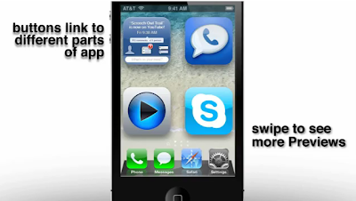
I thought of another alternative to the widgets as well. This time, it's called "App Preview", or just "Preview". Double tap anywhere in the grid pattern that is not an icon (one handed), or pinch-to-zoom (two handed), and the icons immediately expand as if your icon grid is 2x2. The same information and interaction typical of a widget is found on the app icon itself — the App Preview comes with the app download. No need to download anything more.
*And importantly, no need to manage these separately (as you must with widgets) The Preview is coded within every app.
You can swipe in any direction in Preview where there are icons in the normal view. If you're lost, the "home screen pages" reflects which App Preview screen you're in. To exit, double tap the empty space or hit the home button.


![Windows Phone 7, iPhone 4 and Android ina a Grilling Contest [VIDEO]](https://blogger.googleusercontent.com/img/b/R29vZ2xl/AVvXsEiTJhX5qPh4-jJKz8p9lzVL4XzNQsPYF7slI9wScZcE_QS2Vo5xRty50OFafIQkA6oNJFGvRbyCdQlKXkpWqURgUywILJImZBbTON5NT6BDBO7X3n2cYDWrAxbN1d_75sXF7Y_TRWUvmtQ/s72-c/TheGirilling.jpg)
![iPhoneItiPad App Will Let You Make Calls & Send SMS Via Your iPad 2 Soon [Video]](https://blogger.googleusercontent.com/img/b/R29vZ2xl/AVvXsEj8FT9TNm8z5pUwY_KdV2x2DLM447YN_nh5dB4YFjLVGnZr5bndfd3CAVZ0Ej3Ve-6SCukhxN_DFSIfDZaGdiEu5APr-BkdxyTKNL_Uxc9952e5YMzIY7bYVpLWSHxTgCuT8JGz4VqEcv2R/s72-c/PhoneItiPad+for+iPad+2.jpg)
![p0sixninja, saurik And a Lot Of Jailbreak Comunity Members Speak To MyGreatFest [Video]](https://blogger.googleusercontent.com/img/b/R29vZ2xl/AVvXsEiNOkbbg9MKIIKxkVRRMpVNlLwXaeLfXARt0cvl0o8kCa-NNrcPS8opP-uLmp-g-5BmizQWT95SjM_6q7cixlTw88Y1LNrHRa1QDSfVU1cJuhjFkjJJCoZy7AIKhcG6XrUF_80zuXZlzQ/s72-c/Apple-Logo11.png)
![Crazy Man Book Hotel With His iPhone During Skydiving [ Video ]](http://lh6.ggpht.com/-7OX2ZNQfZHA/Tm2Ce569nMI/AAAAAAAAAX8/mM1-hUTdNnA/s72-c/00001_thumb%25255B2%25255D.jpg?imgmax=800)


![How To Fix iTunes Error 9812 [ Windows / Mac ]](https://blogger.googleusercontent.com/img/b/R29vZ2xl/AVvXsEhVzUs2uIDhXC1JqcztwtilN_l2YYMvWIjVERXbrL8HZLekp4GvOHj4_OoosBVJ6S21XXPqPGZUSdamxOCJadPmIixsrBDKy81X_FejHFY1SqaSnwczLCe5rhIIXmruJry-VwRC0YJKmDU9/s72-c/How-to-fix-iTunes-Error-9812.jpg)

No comments:
Post a Comment